
So I started up another Brick Stitch Dishcloth yesterday, this time in Christmas colours instead of Halloween. The variegated yarn contrasted so beautifully with the solid colour in the pattern’s photos that I was inspired to use red yarn alongside red/white/green multicolour yarn.
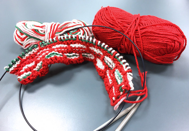
Well, that didn’t look nearly as nice as the pattern’s photos. It looked a hot mess, really, with the red from the variegated yarn blending into the solid red and confusing the pattern. I think that the operative word for a piece like this is “contrast”, i.e. the two yarns should not contain any of the same colours, although they should be complimentary.
I know a lot of people are probably thinking right now, “Who cares? It’s just a cloth. It will be used for wiping up messes and will probably be stained five minutes after it is first used.” That’s probably true. But I still care, I can’t help it. Perhaps I am too much of a perfectionist when it comes to knitting. I am the kind of knitter who will frog way back to a mistake even if it’s imperceptible to anyone but me — even if it’s “just” a cloth I’m knitting. (One of my absolute favourite bloggers, the Yarn Harlot, is this way, so I do not feel quite so alone.) I figure it could have been much worse, since I decided that I hated the colours/patterns together fairly early on in the project. Ah, well. Lesson learned.
